responsive design
A responsive design is when the design is compatible with different screen sizes. For example, mobile and desktop screen sizing. It's incredibly important to have a responsive design as more and more people fluctuate between viewing a site on their mobile or tablet, and their computer. Responsive design ensures that your site looks great no matter what platform someone is on.
mobile first design
Designing with mobile in mind first cuts out a lot of unneccesary work. By working this way, you can make simple(r) changes that will be suitable for larger screens. If you work from desktop -> mobile, it is much more work as down-scaling is much more difficult than up-scaling. Another reason is you don't want the site to respond slowly or sap up all of someone's internet if they are on a smaller device.
frameworks
Frameworks are pre-made CSS style sheets that allow you to draw from them so you don't have to style everything from absolute scratch. They're a very useful tool to cut down on time and allow you to build a nice, responsive, website simply. At first using a framework can be confusing because if you are unsure how to use it (or what does what, exactly) it can take up a lot of your time. However, once you get used to how a framework works, it cuts your time in half. Another draw-back to using a framework is not knowing exactly how something works - it just does.
wireframes
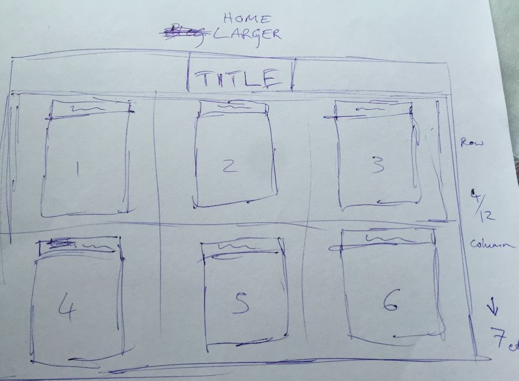
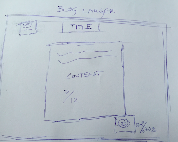
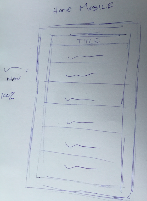
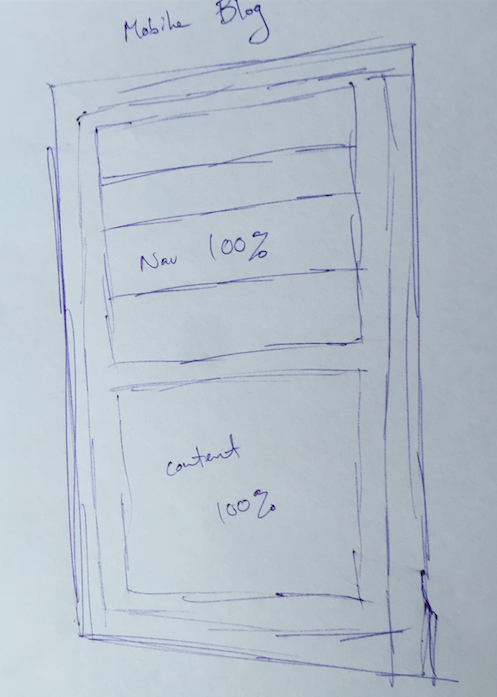
Wireframes are basic design draw-ups that specify general design layouts. Instead of worrying about the fonts, colors, all of the niggly things first, wireframes allow you to focus on the general layout of the design. This is an extremely helpful way, both for the designer, and those working with you. You are able to communicate back and forth quickly to determine placement etc. of content, as opposed to spending hours coding something that they may not like at all. Wireframes are an essential part of not pulling your hair out, and allowing you to visuallise the site easily - you can work on the smaller stuff later!
It was particularly difficult to implement the drop down menu on the blog pages as a lot of drop down menus require javascript to work - however I did find a way to CSS it, it just too waaaay too long and still doesn't look the way I wish it did.
Here is a very basic example of two wireframes I have drawn up for mobile and desktop sites: